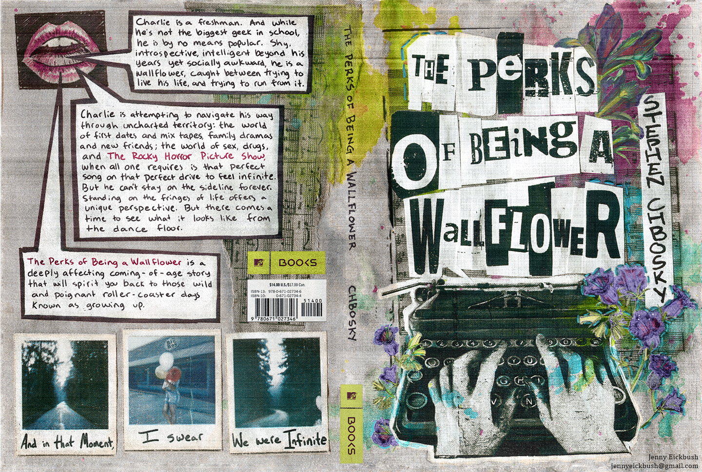
The Perks of Being a Wallflower
follows Charlie and his group of high school friends in the early 1990's. Together, this group publishes a home-made xerox fanzine called "Punk Rocky," that's all about punk rock and The Rocky Horror Picture Show. I wanted this book cover to look like an issue of that magazine.
To really achieve that vintage gritty feel of a 90's punk zine; I painted, cut, and collaged the image together, and then sent the whole thing through an old xerox copy machine. Instead of scanning in my original art, I scanned the copy from the xerox machine.
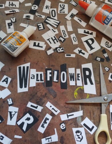
A lot of old punk zines have that almost ransom note look of collaged letters, which I totally dig, and I knew that I wanted to use that aesthetic for the title! I printed off the title words in a bunch of varying fonts and sizes, and then cut out all the individual letters. Then, like some bizarre solo game of scrabble, I pieced together the title.
Everything else on the cover, with the exception of the MTV Books logo and ISBN box, is written with sharpie in my handwriting.
I had to incorporate a Rocky Horror vibe somewhere, so I especially love the back cover blurb in the speech bubbles over the Rocky-esque disembodied red lips.
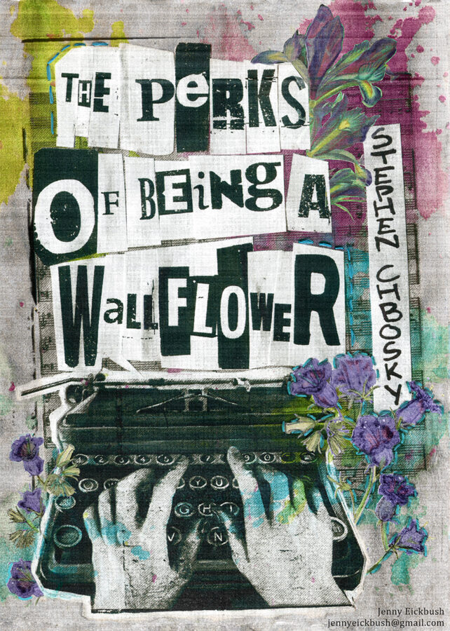
Choosing to incorporate flowers on the cover, I really wanted each flower to mean something.
The whole book is formatted as letters that Charlie is writing to "Dear friend." I chose specific flowers to highlight Charlie's writing.
In Victorian times, some suitors would use flowers to communicate secret messages to the person they were courting. I used this secret language of flowers for my cover.
The flower at the top right is an Iris.
Presenting an Iris meant that you were sending a message, or saying, "I have a secret letter for you." I think it's important that this flower symbolizes a secret message, because in Charlie's first letter, he writes how he doesn't want the recipient of his letters to find out who he is.
The flowers on the bottom of the cover are Canterbury Bells.
The person displaying Canterbury Bells was conveying to their suitor that "your letter has been received." I like to think that in putting Canterbury Bells on the cover, it's like saying that we, as the reader, are accepting and receiving Charlie's letters.


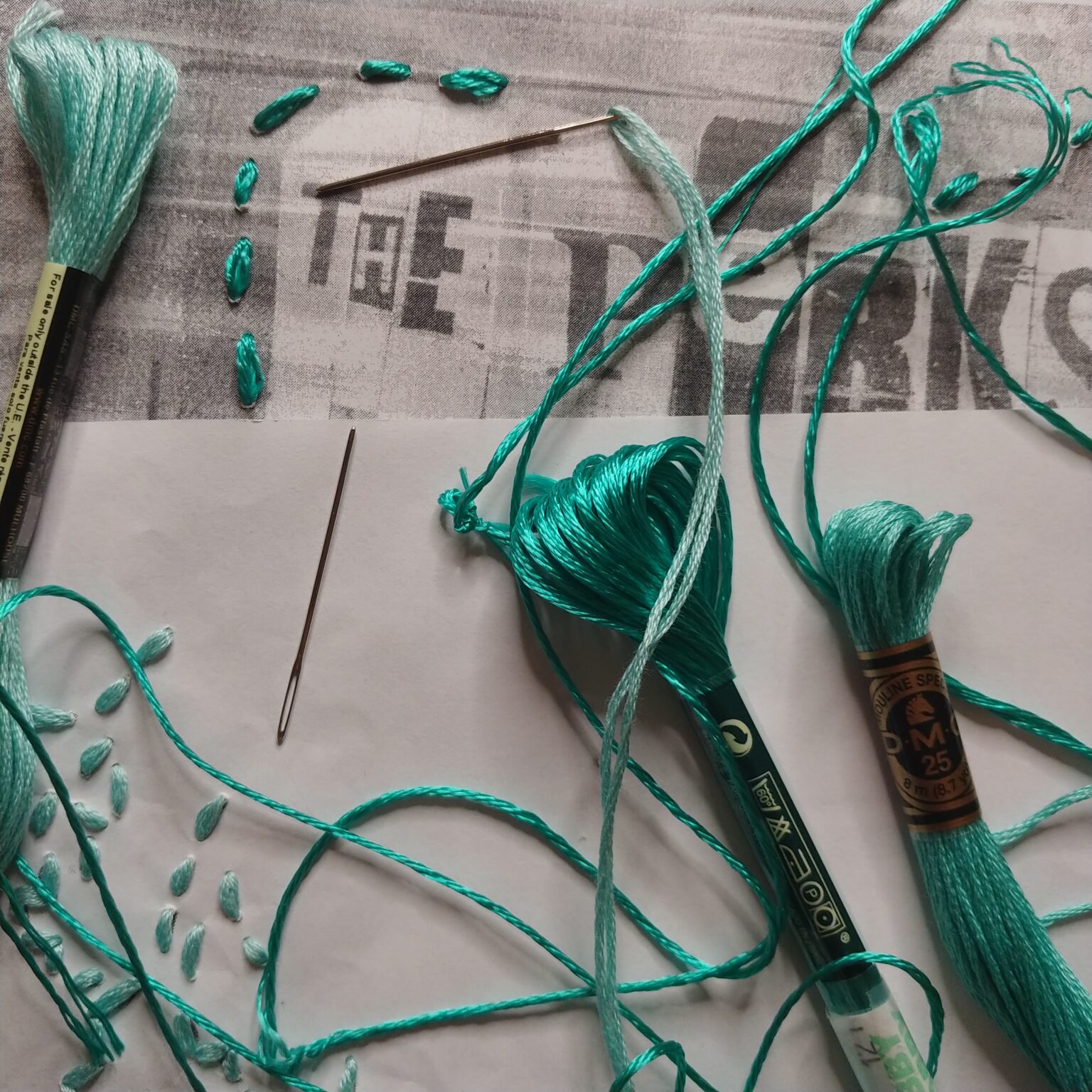
One of the final things I did on this project was put stitching on the page.
I wanted the needle to actually pierce the page, because growing up can be incredibly painful sometimes, and I think we should acknowledge that.
I chose to do the stitching in teal because Charlie is dealing with some PTSD from a traumatic incident that happened in his early childhood, and teal is the color for PTSD awareness.

The Perks of Being a Wallflower is a book that is very dear to my heart. Not just because I grew up in the 90's. Not just because I love the mix tape of songs the author blends throughout the book (although The Smiths actually are one of my favorite bands).
I love this book because it viscerally takes me right back to all the blissfully heart crushing joys and pains of being young and feeling different.
---------------------------------------------------------------------------------------------------
THE PITCH
The Pitch Magazine has been a leading force for news in Kansas City's Arts and Cultural scene since 1980. Published monthly, with over 50,000 copies distributed across the Kansas City Metropolitan area.
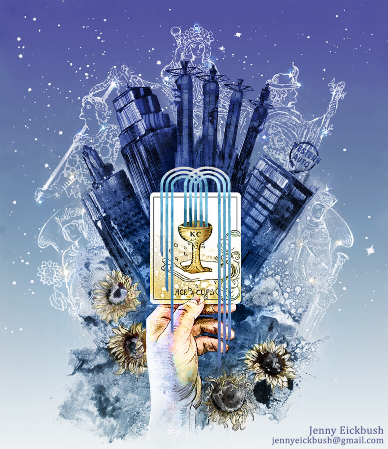
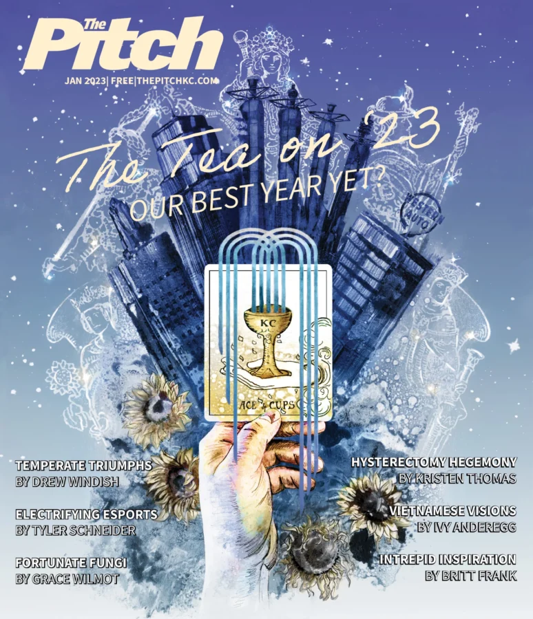
I was asked to create cover art for the January 2023 issue. The assignment was to use tarot card imagery to illustrate a positive reading for Kansas City in the New Year!
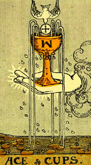
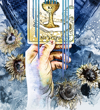
The heart of my design was based around the card "The Ace of Cups." In a tarot reading, this card is an image of good fortune, promising good things and new opportunities; your cup is going to run over with happiness!
I wanted to use this image, but make it more specific to Kansas City. With the nickname, "the city of fountains," the symbol on the Kansas City flag is a flowing waterfall forming a skyscraper. I wanted to take the fountain from the KC flag and use it as the fountain flowing from the Ace of Cups.

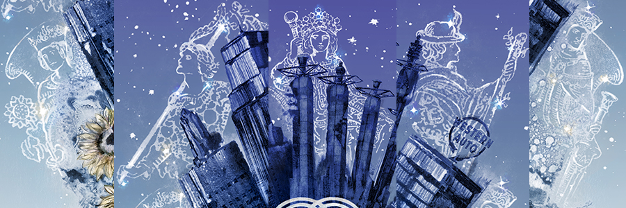
Iconic buildings from the KC skyline frame the central image in this illustration, as more tarot symbols of good fortune form glittering constellations twinkling down on the city. I wanted glad tidings to be written in the stars for Kansas City is 2023!
Featured are the Queen of Wands: courage and determination will lead you through your creative visions
The Fool: A new journey of exciting opportunities is beginning
The Empress: Abundancy and stability
The Ace of Wands: New passions will present themselves, leading to new projects
The King of Cups: A life of generosity and kindness.
The fabulous editor-in-chief, Brock Wilbur, wanted to encorperate the Death card into the image somehow. In tarot, the Death card represents a transformation into a new and better self. It's a fabulous sentiment, but I was worried the imagery itself might be too grim. The card is usually some sort of grim reaper type skeleton.
Instead of using the card's imagery, I took an approach of the life cycle through sunflowers. Kansas is the sunflower state, after all. The cover shows a sunflower in the full bloom of summer, to the decay of winter, and after being watered by the cascading fountain flowing from the ace of cups, back into the rejuvenated growth of spring!
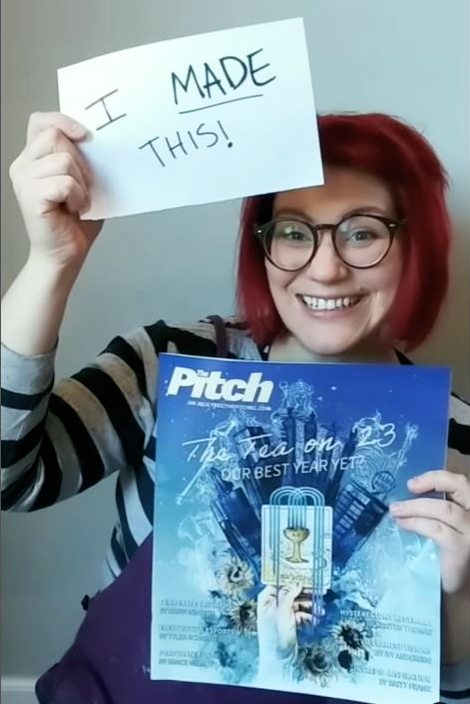
And here it is in print!
You can check out my Instagram account by clicking on the link below for a video with a behind the scenes look at the process of how I brought this image to life!
https://www.instagram.com/jennyeickbush/
Here's to 2023, Kansas City! I know it's going to be a great year for both of us!
